
A space can communicate before anyone reads a word.
Before a visitor notices the logo, speaks to a member of the team, or picks up a brochure, they have already received a message. The height of the structure. The distance between objects. The light. The materials. The empty space. The way people move through it.
This is especially true for exhibition stands and event spaces.
A successful stand does not simply display a brand. It gives people a way to experience it.
So, how does a space tell a story?
It starts by understanding that storytelling in spatial design is not about decorating a space with a narrative. It is about making the narrative visible through the space itself.
Your exhibition stand is a story people can walk into
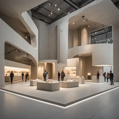
Think about the difference between reading a sentence and entering a room.
A sentence tells you what to think about.
A room can make you feel something before you have consciously decided what you think.
That is the particular power of spatial design.
At a trade show or corporate event, visitors are surrounded by competing messages. Logos, screens, product demonstrations, conversations, graphics and lighting are all asking for attention.
In that environment, an exhibition stand needs more than visibility.
It needs clarity.
The visitor should be able to understand, almost intuitively:
- Who is this?
- What do they do?
- Why should I stop?
- Where should I go?
- What should I discover next?
Good spatial storytelling answers these questions without turning the stand into an instruction manual.
1. Start with the story, not the stand
One of the most common mistakes in exhibition design is beginning with the physical object.
“How large should the stand be?”
“Where should we put the screen?”
“Which materials should we use?”
These are useful questions, but they come later.
First ask:
What should someone understand after spending three minutes here?
That question changes the design process.
Perhaps the story is about innovation.
Perhaps it is about craftsmanship.
Perhaps it is about trust, precision, sustainability, technology or human connection.
The story does not need to be complicated. In fact, a simple story is often easier to experience spatially.
A practical exercise
Write the stand’s story in one sentence:
“We want visitors to leave feeling/understanding ______.”
Then identify three things that support that idea.
For example:
Message: We make complex technology feel simple.
Spatial consequences:
- Keep the visual language clean.
- Make the product easy to understand physically.
- Create a clear, intuitive visitor journey.
This gives the design team a filter. If an element does not support the story, it needs a reason to be there.
2. Think in sequences, not photographs
An exhibition stand is often presented as a beautiful 3D render.
But visitors do not experience a render.
They experience a sequence.
They approach.
They notice.
They enter.
They pause.
They look.
They interact.
They move on.
That sequence is the real story.
A useful way to design this journey is to divide the stand into three simple moments:
The invitation
What makes someone look twice?
This might be a distinctive architectural element, a strong silhouette, an unusual material, a carefully framed product or a sense of openness.
The discovery
What rewards the person for coming closer?
This is where the visitor should find something with substance: a demonstration, conversation, product experience, interactive element or carefully edited information.
The memory
What will they remember five minutes later?
It could be a physical detail, a surprising interaction, a particularly clear explanation or simply the feeling that the brand was confident and easy to understand.
The important point is that these three moments do not need three different visual styles.
They should feel like chapters of the same story.
3. Use architecture to control attention
Every space has a rhythm.
High and low.
Open and enclosed.
Bright and quiet.
Dense and empty.
Fast and slow.
These contrasts can guide attention without relying entirely on graphics.
For example, a high architectural element can create visibility across a busy exhibition hall. A lower, more intimate area can then create a sense of focus for a conversation.
A transparent meeting room communicates something different from a completely enclosed one.
An open product display feels different from a carefully framed one.
This is where exhibition stand design becomes more than visual branding.
Architecture starts doing part of the communication.
Practical tip: map the visual hierarchy
Before adding graphics, identify:
- The first thing people should see.
- The second thing they should notice.
- The detail they discover when they come closer.
- The information they can access if they want to go deeper.
If everything is designed to be noticed first, nothing is.
4. Leave some space for the story to breathe
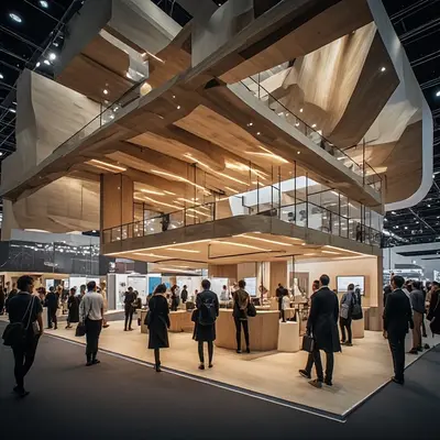
More information does not necessarily create more understanding.
At events, the temptation is understandable. There is a limited amount of space, a lot to communicate and usually several stakeholders with something they want to display.
The result can be visual noise.
White space, open circulation and visual pauses are not wasted space. They give important elements room to be seen.
Think of silence in music.
It is not an absence of sound.
It helps you hear the sound that matters.
The same principle applies to an exhibition stand.
Practical tip: remove before you add
Take a photograph or render of the stand and look at it from the visitor’s perspective.
Ask:
- Can I identify the main message in a few seconds?
- Are there too many competing headlines?
- Are all the screens showing different things?
- Is there enough room to move comfortably?
- Does the architecture have a clear focal point?
- Could anything be removed without weakening the experience?
Often, the strongest design decision is subtraction.
5. Materials have a voice
Materials communicate before they are explained.
Stone can suggest permanence.
Timber can introduce warmth.
Metal can feel precise or technical.
Textiles can soften a large environment.
Glass can create transparency.
But these associations are not universal rules. Context matters, and material choices should respond to the brand, the environment and the audience rather than relying on stereotypes.
The more interesting question is:
What should this material make the visitor notice?
Texture can slow someone down.
Reflection can create movement.
A matte surface can absorb attention rather than compete for it.
A carefully chosen material can become part of the brand experience without carrying a logo.
This is particularly valuable in international events, where a spatial experience can communicate across languages.
6. Light can change the pace of a space
Lighting is often treated as a technical requirement.
It is also a storytelling tool.
Bright, even illumination can make a space feel open and accessible.
A more focused lighting strategy can create hierarchy and direct attention toward a product or interaction.
A change in brightness can separate zones without physically dividing them.
And light can make the same material feel completely different.
The key is not to ask:
“How can we make the stand brighter?”
Ask:
“What deserves attention here?”
That small change in thinking can lead to a much more deliberate lighting strategy.
7. Design the space for people, not just cameras
A stand can look impressive in a photograph and still be uncomfortable to experience.
This happens when the design is optimised for the hero image rather than the visitor.
Real people need somewhere to pause.
They need clear circulation.
They need enough personal space.
They need to understand where an interaction begins and where it ends.
They may arrive alone, in a group, with a colleague, carrying a bag or looking for a quick conversation between meetings.
A good event space design anticipates these different behaviours.
Practical tip: test the stand at human speed
Instead of reviewing only static renders, simulate the visitor journey.
Walk towards the stand from different angles.
Stop where a visitor would naturally stop.
Try to enter.
Try to find the product.
Try to have a conversation.
Then ask:
Does the space still work when people are actually using it?
That test can reveal problems that a beautiful render hides.
8. Create different levels of information
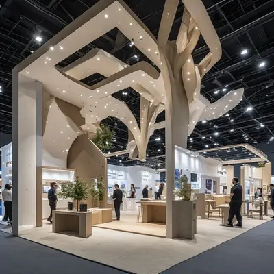
Not every visitor wants the same amount of information.
Someone passing the stand may only have two seconds.
Someone who enters may have two minutes.
A potential client may stay for twenty.
The space should support all three.
This is where a simple information hierarchy becomes powerful.
Level 1: Recognition
Visible from a distance.
Who are you?
Level 2: Understanding
Visible from closer range.
What do you offer?
Level 3: Experience
Discovered through interaction.
Why does it matter?
Level 4: Depth
Available for people who want more.
How does it work? What is the evidence? What happens next?
This layered approach prevents the stand from becoming a wall of information.
It also respects different visitor behaviours without making assumptions about where they come from or how they prefer to engage.
9. Make the brand visible without making everything branded
A strong exhibition stand does not need a logo on every surface.
Sometimes the brand is more powerful when it is expressed through a consistent spatial language.
The proportions.
The colour palette.
The material choices.
The lighting.
The tone of the graphics.
The way staff and visitors interact.
The relationship between open and private areas.
These details can create recognition without repetition.
A useful test is to temporarily remove the logo from the design.
Does the space still feel like the brand?
If the answer is no, there may be an opportunity to develop a stronger spatial identity.
10. Give visitors something to remember
A story needs a memorable moment.
It does not have to be spectacular.
In fact, the most memorable element may be surprisingly small.
A beautifully detailed product.
A clever transition between spaces.
A material visitors want to touch.
A demonstration that explains a complex idea in seconds.
A quiet meeting area that feels unexpectedly calm inside a busy exhibition hall.
Memory often comes from contrast.
The stand is busy outside and calm inside.
The product is complex but the explanation is simple.
The architecture is large but the visitor experience feels personal.
These moments create a sense of discovery.
And discovery is one of the most useful ingredients in spatial storytelling.
A simple framework for designing a stand that tells a story
Before finalising an exhibition stand, run through these five questions:
1. What is the story?
Can you describe the central idea in one sentence?
2. What is the first impression?
What does someone understand before reading anything?
3. What is the journey?
What happens between approaching the stand and leaving it?
4. What creates the memory?
Which detail, interaction or spatial moment is likely to stay with the visitor?
5. What can be removed?
Which elements compete with the story rather than supporting it?
If these five questions have clear answers, the stand is already doing more than displaying information.
It is communicating.
The space becomes the message
The most effective exhibition stands do not separate brand, architecture and experience into different layers.
They allow them to become one thing.
The structure creates visibility.
The circulation creates a journey.
Materials create atmosphere.
Light creates hierarchy.
Content creates understanding.
People create connection.
Together, these elements form a story that visitors do not simply read.
They move through it.
And that may be the most interesting thing about spatial storytelling: the visitor is not outside the story looking in. They become part of it.
For brands exhibiting across different markets and cultures, this is particularly valuable. A spatial idea can travel without depending entirely on language. It can create clarity while leaving room for different people to interpret, explore and engage with the brand in their own way.
A successful stand is not just a place where a company appears.
It is a place where the company becomes tangible.
And when the space tells the story well, visitors can understand the brand before anyone has explained it.