
Design is usually created with good intentions.
A room should feel welcoming. A costume should move beautifully. A piece of furniture should make life easier. A light should reveal something worth looking at.
And yet, occasionally, something happens between the drawing board and reality.
The chair is beautiful but impossible to sit on. The spectacular fabric looks magnificent in the showroom and strangely flat under stage lights. The carefully planned lighting makes the room feel like a dentist’s office.
Nothing exploded. Nobody necessarily made a terrible decision.
It simply… didn’t work.
Welcome to Kaotika FAILS.
The curious art of getting design wrong
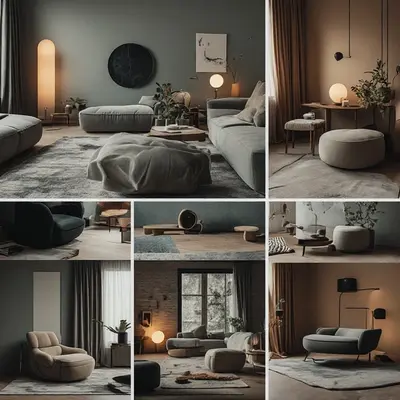
Some design mistakes are obvious.
Others take a little longer to notice.
A door opens directly into another door. A pendant light hangs precisely where someone needs to stand. A beautiful sofa occupies so much visual space that the room suddenly feels smaller than it did before.
And then there are the mysterious ones.
Everything looks right individually.
Together, somehow, it doesn’t.
This is where design becomes interesting.
Because a design fail is rarely just about one bad object or one questionable colour choice. More often, it is about relationships: between scale and space, material and light, colour and atmosphere, movement and structure.
Design does not exist in isolation.
It has to survive contact with reality.
When beautiful becomes inconvenient
One of the more entertaining categories of design problems is the object that performs beautifully in photographs.
It looks elegant.
It has excellent proportions.
It appears to belong in a magazine.
And then someone tries to use it.
Suddenly, the elegant chair has nowhere to put your arms.
The minimalist coffee table has an edge precisely at knee height.
The sculptural staircase seems to have been designed for people with excellent balance and no luggage.
This doesn’t necessarily make the object badly designed.
It may simply mean that visual design and functional design have stopped talking to each other.
A beautiful object still has to be lived with.
The scale problem
Scale is one of those things that seems obvious until it isn’t.
A large room can make a perfectly respectable sofa look surprisingly small.
A tiny room can turn an innocent-looking armchair into architectural infrastructure.
The same object can feel elegant in one space and completely overwhelming in another.
This is why interior design mistakes often have less to do with the object itself and more to do with proportion.
A chandelier is not inherently too large.
It is too large for that room.
A pattern is not necessarily too dramatic.
It may simply be competing with everything else.
A sculpture is not too imposing.
Perhaps the ceiling is too low.
Design is a conversation between things.
Sometimes one of them is simply speaking too loudly.
When colour has other plans
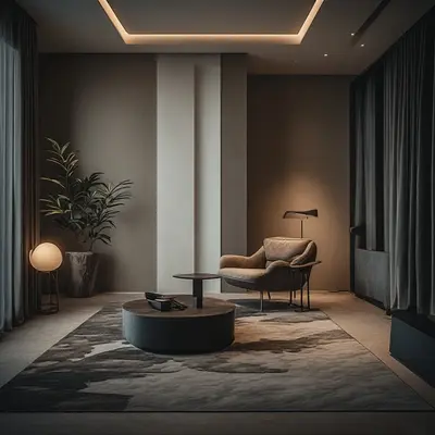
Colour is particularly good at creating unexpected results.
A shade that looks soft and sophisticated on a sample card can become surprisingly energetic when covering an entire wall.
A warm beige can suddenly look pink.
A grey can appear blue.
A supposedly calm green can acquire an entirely different personality beneath artificial light.
This is one reason lighting and colour should never be treated as separate subjects.
Light changes how we perceive colour.
The direction, intensity and temperature of the light can alter the atmosphere of an entire room.
The same paint can tell a different story at 10 a.m. and 10 p.m.
The colour has not changed.
Our perception has.
When fabric refuses to cooperate
Fabric has its own ideas.
This is especially obvious in stage design.
A textile may look fluid on a table and become unexpectedly stiff when worn. Another may appear wonderfully opaque in daylight but become almost transparent beneath stage lighting.
Then there is movement.
Some fabrics float.
Some swing.
Some cling.
Some develop a completely independent relationship with gravity.
And static electricity, naturally, likes to participate.
This is where fabric becomes more than a surface.
It becomes a moving material.
Its weight, weave, transparency, drape and reaction to light all influence the final result.
A costume can therefore look perfect on a mannequin and behave completely differently once a performer starts moving.
The design hasn’t necessarily failed.
Reality has simply joined the creative team.
The lighting plot twist
Lighting is one of the great invisible forces in design.
We often notice objects first.
We notice the sofa, the wall colour, the artwork, the costume.
But light decides how much of all that we actually see.
A badly positioned light can flatten texture.
Too much light can erase atmosphere.
Too little can make carefully chosen materials disappear.
A cool light can make a warm interior feel unexpectedly distant. A strong directional source can turn a delicate fabric into a completely different visual object.
And sometimes the problem is not the light itself.
It is what the light reveals.
A beautifully textured wall suddenly develops a dramatic shadow.
A carefully arranged room acquires one mysterious dark corner.
A costume that looked smooth suddenly discovers every fold it has ever made.
Light can be wonderfully honest.
Occasionally, perhaps, a little too honest.
When more becomes less
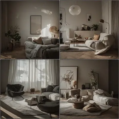
There is a moment in many design projects when adding one more thing seems like a good idea.
Another cushion.
Another pattern.
Another decorative object.
Another light.
Another colour.
And then another.
Until the room begins to feel less like a composition and more like a meeting where everybody has decided to speak at once.
This is one of the classic interior design mistakes: confusing abundance with richness.
Richness can come from texture, contrast, depth, repetition and variation.
It does not necessarily require more objects.
Sometimes removing one thing reveals five others.
Good design is not always about adding.
Sometimes it is about knowing when to stop.
The problem with designing for the photograph
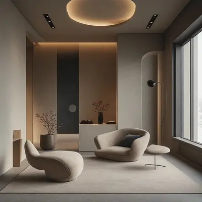
Photography has quietly changed the way we think about spaces.
A room can be designed to look spectacular from one particular angle.
But real people do not live inside photographs.
They walk around.
They sit down.
They open cupboards.
They switch lights on.
They move chairs.
They carry bags.
They spill things.
They exist in three dimensions.
A space that works beautifully from the entrance may feel completely different from the sofa.
A restaurant may look wonderful in an architectural photograph while having one table positioned directly beside the busiest passage.
A showroom may create an immaculate composition that would be rather inconvenient as an actual living room.
This is not necessarily bad design.
It is a reminder that design has more than one viewpoint.
Why design fails are useful
Perhaps the most interesting thing about design fails is that they teach us more than perfection does.
A successful design can be admired.
A failed design can be investigated.
Why did it happen?
Was the scale wrong?
Did the material behave differently?
Did the lighting change the colour?
Was the space considered only from one viewpoint?
Did aesthetics win an argument against function?
Or did several perfectly reasonable decisions simply create an unreasonable result when combined?
These questions are useful far beyond interiors.
They apply to fashion, stage design, architecture, photography, product design and visual storytelling.
Every unexpected result contains information.
Sometimes quite a lot of it.
Designing for the unexpected
Good design does not mean eliminating every possibility of failure.
That would be rather difficult.
Materials change.
Light changes.
People move.
Spaces behave differently at different times of day.
A fabric may react differently on stage than it does in a studio.
A colour may appear different on screen than it does on a wall.
Design happens inside a changing world.
Perhaps the real skill is not predicting everything.
Perhaps it is learning how to observe what happens next.
That is where a design mistake can become something more useful: a question.
Why did this happen?
What does it reveal?
And what could we do differently?
The Kaotika FAILS philosophy
At Kaotika, a fail doesn’t have to mean disaster.
Sometimes it is simply the moment when an idea meets reality and reality raises an eyebrow.
And that is worth looking at.
Because design becomes more interesting when we stop asking only:
“Does it look good?”
And start asking:
“What happens when someone actually uses it?”
Does it move?
Does it age?
Does the light change it?
Does the space support it?
Does the material behave?
Does the atmosphere survive?
Does the beautiful idea still work when the photograph is over?
These are not questions about perfection.
They are questions about observation.
And perhaps that is the most useful lesson of all.
Sometimes design goes wrong.
That is not the end of the story.
It may actually be where the interesting part begins.