How to Make Polyester Costumes Look Luxurious Under Stage Lights and on Camera
Colour Is the First Emotion
Long before an audience recognises the cut of a costume, the quality of its fabric or the skill of its tailoring, they respond to something far more immediate.
Colour.
It is often the very first visual decision the human brain makes.
Within fractions of a second, colour establishes atmosphere before movement has begun. It suggests warmth or distance, elegance or violence, intimacy or grandeur. A deep burgundy gown carries a different emotional weight from a brilliant scarlet dress, even if both are made from exactly the same fabric. Midnight blue whispers where bright cobalt proclaims. Black can conceal, reveal, intimidate or comfort depending entirely upon the light surrounding it.
Yet colour is one of the greatest illusions in costume design.
A garment has no colour of its own.
It merely reflects certain wavelengths of the light that reaches its surface while absorbing others. Change the light, and the colour changes with it.
This principle seems obvious in theory, yet it is frequently forgotten in practice.
A costume selected beneath the neutral lighting of a workshop may appear entirely different beneath the warm amber glow of a theatre, beneath the cool precision of modern LED fixtures, or through the colour science of a digital cinema camera. Polyester complicates this relationship even further because its smooth fibres reflect not only colour, but also the quality and direction of the illumination itself.
Consequently, choosing the correct colour for a costume is only half the task.
Learning how to illuminate that colour is equally important.
The same deep burgundy can appear noble or inexpensive.
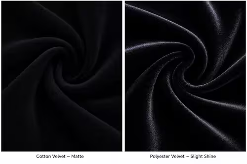
The same black costume can suggest velvet or vinyl.
The difference rarely lies within the dye.
It lies within the light.
Black: The Colour That Reveals Everything
At first glance, black appears to be the safest choice for polyester.
It hides wrinkles.
It absorbs attention.
It rarely competes with scenery.
Many dance companies favour black costumes precisely because they appear timeless and versatile.
Ironically, black is also one of the most demanding colours to illuminate successfully.
True black is never entirely black.
Even the deepest natural fibres reflect small amounts of light. Those subtle reflections allow the audience to perceive folds, movement and texture. Remove them completely and the costume becomes an indistinct silhouette, disappearing into the stage itself.
Polyester introduces a different challenge.
Instead of scattering reflections softly across irregular fibres, its smoother surface often concentrates them into narrow bands of brightness. Under a poorly positioned spotlight, what should resemble deep velvet may suddenly reveal bright silver streaks travelling across shoulders, sleeves or skirts.
The audience no longer experiences black.
They experience contrast.
This is why black polyester often receives an unfair reputation for looking inexpensive. The colour itself is rarely responsible. It is the abrupt transition between darkness and intense specular highlights that attracts attention.
Natural fibres generally produce gentler transitions.
Synthetic fibres often produce sharper ones.
The lighting designer’s task is therefore not to eliminate reflection but to soften the relationship between shadow and highlight.
Large diffused sources are particularly effective because they broaden reflections instead of concentrating them. Side lighting allows highlights to travel gracefully across the garment rather than returning directly toward the audience. Carefully balanced back light separates the performer from dark scenery without forcing the front of the costume into excessive brightness.
Equally important is the surrounding environment.
Black costumes surrounded by bright scenery frequently require more frontal illumination simply to remain visible. The increased intensity often exaggerates reflective areas. Conversely, darker scenery allows more restrained lighting, preserving both depth and texture.
For cinematography, black polyester demands even greater care.
Modern digital sensors capture subtle tonal differences exceptionally well—provided those differences remain within the available dynamic range. Excessive contrast between highlights and shadow may force the camera into difficult compromises. The reflective portions of the costume approach clipping while darker regions lose detail.
Slight underexposure is often preferable to aggressive brightness.
Texture hidden within shadows can usually be recovered during grading.
Blown highlights cannot.
Perhaps more than any other colour, black teaches an essential lesson.
Darkness is not the absence of light.
It is the careful control of light.
When illuminated with patience, black polyester ceases to resemble synthetic fabric altogether. Instead, it becomes a canvas upon which movement itself is painted.
Burgundy: The Quiet Luxury of Warmth
If black is defined by restraint, burgundy is defined by memory.
It recalls theatre curtains worn smooth by decades of performances. Old leather-bound books. Fine wines resting in cellar darkness. Polished mahogany illuminated by candlelight.
Few colours possess such immediate associations with richness.
Yet burgundy is remarkably complex.
It exists somewhere between red, brown and violet, constantly shifting according to its surroundings. Under warm illumination it becomes luxurious and inviting. Under cooler light it may lose much of its depth, drifting toward ordinary crimson or muted maroon.
Polyester magnifies these changes.
Because its fibres reflect light more directly than many natural textiles, the balance between colour and highlight becomes especially delicate. Excessively cool illumination often causes reflections to dominate, reducing the subtle tonal variation that gives burgundy its distinctive sophistication.
Warm white lighting, particularly between approximately 3000 K and 3500 K, frequently allows burgundy polyester to display its greatest richness.
The colour appears deeper.
The reflections become less clinical.
The costume begins to suggest weight rather than gloss.
This relationship is not merely physical.
It is psychological.
Our visual system associates warm illumination with familiar natural sources—sunset, candlelight, incandescent lamps—and therefore tends to interpret richly coloured fabrics as softer and more luxurious beneath these conditions.
The same garment illuminated with very cool white LEDs may appear technically accurate while simultaneously losing much of its emotional warmth.
Neither approach is inherently correct.
Historical productions often benefit from warmer palettes.
Contemporary works may intentionally embrace cooler, more architectural lighting.
The key is consistency.
Burgundy responds beautifully when every element of the visual environment speaks the same language.
Conflicting colour temperatures rarely flatter it.
Movement further enriches the colour.
Flowing skirts reveal subtle transitions between illuminated folds and deeper interior shadows. Because burgundy naturally occupies a middle range of brightness, these gradual tonal shifts contribute enormously to the impression of expensive fabric.
Lighting should therefore encourage movement across the garment rather than flatten it with excessive frontal illumination.
Many experienced lighting designers prefer allowing portions of burgundy costumes to fall gently into shadow.
This may seem counterintuitive.
Surely audiences should see every detail.
Yet complete visibility is not always desirable.
Mystery often contributes more elegance than perfect clarity.
The richest velvet curtains in an opera house reveal only fragments of their texture at any given moment. Their beauty lies partly in what remains concealed.
Burgundy polyester benefits from the same philosophy.
Allow the light to suggest rather than describe every surface.
The audience’s imagination will complete the illusion.
Midnight Blue: The Colour of Distance
Among all colours used in theatre and dance, few possess the quiet authority of midnight blue.
Unlike bright blue, which readily attracts attention, midnight blue rarely announces itself immediately. It emerges gradually, revealing its character only after the audience has spent time within the visual world of the performance.
In daylight it may appear almost black.
Under carefully balanced stage lighting it acquires extraordinary depth, suggesting moonlit skies, distant oceans and infinite space.
This ambiguity is precisely what makes it so powerful.
Yet it also presents significant challenges for polyester.
The colour sits delicately between darkness and saturation. Too little illumination and the audience perceives only black. Too much direct light and the blue becomes unexpectedly bright, losing the quiet dignity that defines it.
Smooth synthetic fibres can complicate this balance further by introducing cool specular reflections that shift toward cyan. Instead of enriching the costume, these highlights flatten its colour, making the fabric appear harder and more synthetic than intended.
The solution lies not in increasing saturation through lighting but in preserving tonal subtlety.
Midnight blue rewards gentle gradients.
Soft side lighting allows folds to reveal different shades of blue within the same garment, creating the impression of remarkable depth. Carefully controlled back light outlines movement without overwhelming the front of the costume. Diffused overhead illumination can suggest moonlight while avoiding the sharp reflections that frontal spotlights often produce.
Colour temperature again plays an essential role.
Slightly warm neutral light often produces the richest midnight blue because it maintains contrast without pushing highlights toward icy tones. Excessively cool illumination may appear visually impressive at first, but it frequently strips away the warmth that prevents synthetic fabrics from looking metallic.
The relationship between midnight blue and background scenery deserves equal attention.
Placed against black, the costume may disappear unless subtle edge lighting defines its silhouette. Positioned against lighter scenery, reflections become far more noticeable because contrast increases dramatically.
This delicate balancing act explains why midnight blue has long remained a favourite among experienced costume designers.
When handled carelessly, it is unforgiving.
When illuminated thoughtfully, it becomes almost impossible to imitate with any other colour.
It possesses an elegance that never demands attention.
Instead, it quietly rewards those willing to look a little longer.
And perhaps that is its greatest strength.
Emerald Green: Light Beneath the Surface
Few colours have the ability to suggest richness as effortlessly as emerald green.
It occupies a curious place within the visual imagination. It recalls polished gemstones, dense forests after rainfall, oxidised bronze, and the quiet luxury of antique velvet curtains. Unlike brighter greens, which often feel energetic or youthful, emerald possesses gravity. It is a colour that seems to absorb history.
On stage, however, emerald green is remarkably sensitive to light.
Its beauty depends not simply on saturation, but on depth. The audience should feel that the colour extends beneath the surface of the fabric, almost as though it were illuminated from within. This illusion becomes particularly challenging when the costume is made from polyester.
Smooth synthetic fibres naturally encourage stronger specular reflections. Under an undiffused spotlight, those reflections often become brighter than the green itself. Instead of perceiving a rich jewel tone, the audience begins to notice a layer of white glare floating above the colour.
The emerald disappears.
Only the reflection remains.
This effect is especially common with modern LED fixtures that produce highly directional beams. Although these luminaires provide excellent efficiency and colour control, their concentrated output can flatten the visual complexity that gives emerald its distinctive character.
Fortunately, the solution is rarely complicated.
Large, diffused sources restore depth by allowing highlights to spread gradually across the fabric. Rather than interrupting the colour, they become part of it. Side lighting introduces subtle transitions between illuminated and shaded folds, allowing several shades of green to exist simultaneously within the same garment.
This variation is essential.
Nature almost never presents emerald as a single uniform colour. A forest canopy contains hundreds of greens within every branch. A polished gemstone reveals changing tones as it moves. Our eyes instinctively associate these variations with authenticity.
Lighting should therefore encourage diversity rather than uniformity.
Movement plays an equally important role.
A slowly turning dancer allows emerald highlights to drift gently across the costume, creating the impression that the colour itself is alive. Rapid, uncontrolled reflections, by contrast, often suggest plastic rather than precious stone.
Perhaps no other colour rewards patience quite so generously.
Emerald should never shout.
It should quietly invite the audience to continue looking.
Bright Red: Energy Without Harshness
If emerald whispers, bright red speaks immediately.
No colour commands attention more quickly.
From the earliest theatrical traditions to contemporary dance productions, vivid red has symbolised passion, danger, celebration, sacrifice and power. It possesses enormous visual authority, often becoming the first element an audience notices upon entering the auditorium.
This natural dominance presents both opportunities and challenges.
Because bright red already attracts attention through colour alone, it requires remarkably little assistance from lighting. Excessive illumination often overwhelms it, pushing reflections beyond the point of elegance and causing the costume to appear synthetic.
Polyester magnifies this tendency.
The intense spectral purity of many modern red dyes combines with the reflective nature of synthetic fibres to create highlights that can become visually aggressive, particularly under cool white LED lighting.
Digital cameras introduce another complication.
Red occupies a unique position within many imaging systems. High saturation combined with strong reflections can exceed the sensor’s capacity to record subtle tonal variation. The result is a costume that appears flat despite its extraordinary brightness.
Experienced cinematographers therefore approach bright red with surprising restraint.
Rather than increasing exposure to emphasise its intensity, they often protect highlight detail even at the expense of allowing portions of the costume to fall into deeper shadow.
This decision preserves richness.
Texture survives.
Movement remains visible.
From the audience’s perspective, the costume appears more luxurious precisely because it is not illuminated equally everywhere.
The surrounding environment becomes equally significant.
Bright red against neutral scenery immediately assumes visual leadership. Against richly coloured backgrounds, however, it benefits from carefully controlled contrast that allows the costume to remain prominent without becoming isolated from the stage picture.
Light should support red.
It should never compete with it.
Like an accomplished soloist within an orchestra, bright red already possesses enough presence of its own.
The lighting designer’s role is not to make it louder.
It is to ensure that its voice remains beautiful.
Dark Cherry: The Colour of Memory
There are colours that describe the present, and there are colours that seem to carry echoes of the past.
Dark cherry belongs unmistakably to the latter.
It evokes polished wood inside old theatres, aged velvet seats, lacquered instruments resting beneath warm stage lights and the quiet elegance of historical costume.
Unlike bright red, dark cherry rarely announces itself immediately.
Instead, it unfolds gradually as the eye adapts to the surrounding light.
This slow revelation gives the colour much of its emotional power.
Polyester responds surprisingly well to dark cherry because the colour itself naturally disguises many of the abrupt transitions that reveal synthetic fibres. The deeper pigment absorbs more light, allowing reflections to integrate more gently into the overall appearance of the garment.
Nevertheless, poor lighting can quickly destroy this advantage.
Strong frontal illumination often separates highlights from the underlying colour, producing pale reflective streaks that interrupt the smooth continuity of the fabric.
The illusion of richness disappears almost instantly.
Soft lateral lighting tells a different story.
Instead of isolated reflections, broad luminous gradients emerge across folds and seams. Dark cherry begins to resemble the subtle complexity of antique velvet rather than dyed synthetic cloth.
Warm colour temperatures enhance this effect further.
Amber tones enrich the brown undertones hidden within the pigment, creating extraordinary visual depth without excessive saturation.
Cooler illumination may certainly be used for dramatic purposes, particularly in contemporary productions, but it often shifts the colour toward ordinary crimson while simultaneously increasing the visibility of specular highlights.
Dark cherry rewards subtlety.
It asks the lighting designer to resist the temptation of excessive brilliance.
Its beauty has always belonged to shadow as much as to light.
Purple: Between Mystery and Majesty
Few colours possess a history as complex as purple.
For centuries it symbolised authority, spirituality and wealth. Natural purple dyes were once among the most expensive pigments available, ensuring that the colour became associated with royalty long before modern synthetic chemistry made it widely accessible.
Perhaps this historical memory still influences our perception today.
Purple rarely appears ordinary.
Even in contemporary productions it retains a sense of ceremony.
For polyester, however, purple presents fascinating optical challenges.
Because it combines red and blue in delicate balance, small changes in illumination can dramatically alter its appearance. Warm light strengthens its crimson character. Cooler illumination encourages blue, sometimes pushing the costume toward violet.
These shifts can be beautiful.
They can also become distracting if they occur unintentionally.
Reflective highlights introduce further complexity.
Specular reflections often carry little of the underlying pigment, appearing almost white regardless of the fabric’s actual colour. On purple polyester these highlights may fragment the visual continuity of the garment, particularly when produced by narrow, high-intensity beams.
Diffusion once again becomes an invaluable ally.
By enlarging the apparent size of the light source, reflections become broader and less conspicuous. Instead of breaking the colour into separate regions, they reinforce its volume.
Purple possesses another remarkable quality.
It responds exceptionally well to carefully controlled back lighting.
A gentle rim of light outlining the performer often enhances the richness of the costume without requiring additional frontal illumination. The silhouette acquires quiet radiance while the front of the garment retains its depth.
This balance allows purple to remain mysterious rather than theatrical in the exaggerated sense of the word.
Mystery, after all, depends upon restraint.
Colour Exists Only in Light
By now a pattern has emerged.
Every colour discussed throughout this chapter responds differently to illumination.
Black demands careful control of reflections.
Burgundy flourishes beneath warmth.
Midnight blue depends upon tonal subtlety.
Emerald seeks depth.
Bright red rewards restraint.
Dark cherry embraces shadow.
Purple thrives on balance.
Yet beneath these individual characteristics lies a single unifying principle.
No colour exists independently of light.
A costume stored in darkness possesses no visible colour whatsoever. Its pigments remain unchanged, yet colour itself disappears because colour is not a property that exists in isolation. It is born only when light reaches the surface and begins its journey toward the observer.
This simple truth carries profound consequences for theatre and cinematography.
Costume design and lighting design are not separate disciplines meeting accidentally during rehearsals.
They are complementary arts describing the same phenomenon from different directions.
The costume designer chooses how the fabric will respond.
The lighting designer decides how that response will be perceived.
Neither can achieve its full potential without the other.
Polyester illustrates this relationship with remarkable honesty.
Its reputation has often suffered because it reveals lighting decisions more openly than many natural fibres. Yet this apparent weakness is also one of its greatest strengths.
It teaches us to observe.
To understand.
To design with intention rather than habit.
When illuminated carelessly, polyester faithfully records every mistake.
When illuminated thoughtfully, it reveals something far more interesting.
That elegance is rarely hidden inside a fibre.
It is created in the invisible space where light, colour, movement and perception meet.
And perhaps that is the deepest lesson colour can offer.
The audience does not remember wavelengths or colour temperatures. They remember emotions. They remember the quiet dignity of midnight blue, the warmth of burgundy, the authority of black, the radiance of emerald, the fire of red and the mystery of purple.
They remember how those colours made them feel.
Everything else—including the fibre from which the costume was woven—quietly disappears into the illusion.